chevron_left menu MENU
  • chevron_right
  • chevron_right
  • chevron_right
  • chevron_right
chevron_right
not (pageUrl eq null and supportPageUrl eq null) and attributes/any(a: a eq 'Product_Portfolio|Jabra') and (attributes/all(a: a ne 'Meta_Refurbished|True') or attributes/any(a: a eq 'Meta_Accessorytype|17'))
close

Typography

GN Elliot is used for all our headline and body text, for both print and digital applications.

Headlines

Headline 1

<h1></h1>
GNElliotWeb, "Lucida Sans Unicode", sans-serif / 600
56px / 66px    46px / 54px    34px / 44px

Headline 2

<h2></h2>
GNElliotWeb, "Lucida Sans Unicode", sans-serif / 600
46px / 54px    34px / 44px    24px / 30px

Headline 3

<h3></h3>
GNElliotWeb, "Lucida Sans Unicode", sans-serif / 600
34px / 44px    24px / 30px    18px / 24px

Headline 4

<h4></h4>
GNElliotWeb, "Lucida Sans Unicode", sans-serif / 400
24px / 30px    18px / 24px    15px / 20px
New
<span class="new-label"></span>
GN Elliot | 18 px | 400

Paragraphs

<p></p>

Bacon ipsum dolor amet burgdoggen chicken pork loin kevin alcatra chuck. Sirloin doner rump shankle leberkas tongue. Kielbasa fatback turkey pig kevin. Frankfurter pig pork, bacon ball tip ham hock beef rump alcatra picanha.

Swine pork belly leberkas ham sirloin short loin beef ribs t-bone porchetta kielbasa shank pork ball tip. Tail pork ribeye turkey ham pork belly ham hock pork chop short ribs meatball doner hamburger bresaola fatback jowl.
 

GN Elliot / 400
18px / 24px    15px / 20px

Headline spacing

<p></p>
<h3></h3>

Bacon ipsum dolor amet burgdoggen chicken pork loin kevin alcatra chuck. Sirloin doner rump shankle leberkas tongue. Kielbasa fatback turkey pig kevin. Frankfurter pig pork, bacon ball tip ham hock beef rump alcatra picanha.

Headline

Swine pork belly leberkas ham sirloin short loin beef ribs t-bone porchetta kielbasa shank pork ball tip. Tail pork ribeye turkey ham pork belly ham hock pork chop short ribs meatball doner hamburger bresaola fatback jowl.
 

24px margin above <h3></h3> when after <p></p>

Hyperlinks

Text with a hyperlink in the middle
Text with a <a href="#">hyperlink</a> in the middle
Text with a bold link below.

Read more

Buy Now From $279.00

<a href="#" class="jbr-btn jbr-btn--text">Read more</a>
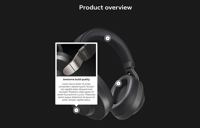
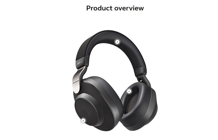
Templates

Frontpage spot

NEW

Jabra Elite 25e

Best-in-class battery
for wireless calls and music

Enjoy up to 18 hours of battery time, wind and water resistance,
and a new neckband design for a great fit and all-day comfort.

Show Me More
<span class="new-label">NEW</span>
<h1>Jabra Elite 25e</h1>
<h3>Best-in-class battery <br>for wireless calls and music</h3>
<p>Enjoy up to 18 hours of battery time, wind and water resistance,<br> and a new neckband design for a great fit and all-day comfort.</p>
<a class="jbr-btn jbr-btn-large jbr-btn--yellow" href="/bluetooth-headsets/jabra-elite-25e">Show Me More</a>

Category topbanner

Office Headsets

For Concentration & Conversation

Get Your Free Trial
<h1>Office Headsets</h1>
<h3>For Concentration &amp; Conversation</h3>
<a class="jbr-btn jbr-btn--yellow jbr-btn-large jbr-btn-trial" href="#" scroll-to="{5498EE66-C77F-447F-8370-A41365B1F6F9}">Get Your Free Trial</a> 

KSP spot

BATTERY

All-day power

Now with a battery that delivers 4.5 hours of play time, coupled with a portable charging case you have a total 13.5 hours of power at your disposal.

<h4>BATTERY</h4>
<h2>All-day power</h2>
<p>Now with a battery that delivers 4.5 hours of play time, coupled with a portable charging case you have a total 13.5 hours of power at your disposal.</p>

Color palettes

Primary Jabra Colors

Jabra primary colors are black and yellow. Use the supporting and secondary color palette, only if necessary

Jabra Yellow
#ffd100
R255 G209 B0
C0 M9 Y100 K0
PANTONE® 109 C
Jabra Rich Grey
#54585a
R84 G88 B90
C48 M29 Y26 K76
PANTONE® 425 C

Primary BlueParrott Colors

BlueParrott Purple
#333264
rgb(51, 50, 100)
BlueParrott Blue
#1080C4
rgb(19, 128, 196)
BlueParrott Gray
#A7A8AA
rgb(167, 168, 170)
Jabra Black
#212721
rgb(33, 39, 33)

Secondary

Jabra secondary colors are blues and purples. We also adopt GN orange and use the supporting color palette if necessary.

GN Dark Blue
#253746
rgb(37, 55, 70)
GN Blue
#5c88da
rgb(92, 136, 218)
GN Purple
#9063cd
rgb(144, 99, 205)
GN Orange
#ea7200
rgb(234, 114, 0)

Tertiary

PMS Black 3C
#212721
PMS 440C
#382E2C
PMS Warm gray 4C
#B6ADA5

Buttons

Only 1 yellow btn in viewport.
In general use outline btn's (#999 or #fff)
Hover color is #333 (except white outline btns -> become white)

Colors

White background

<a href="#" class="jbr-btn jbr-btn-large jbr-btn--yellow">Yellow button</a>
<a href="#" class="jbr-btn jbr-btn-large jbr-btn--dark">Dark button</a>
<a href="#" class="jbr-btn jbr-btn-large jbr-btn--dark-outline">Outline button</a>

Light background

<a href="#" class="jbr-btn jbr-btn-large jbr-btn--yellow">Yellow button</a>
<a href="#" class="jbr-btn jbr-btn-large jbr-btn--dark">Dark button</a>
<a href="#" class="jbr-btn jbr-btn-large jbr-btn--dark-outline">Outline button</a>

Dark background

<a href="#" class="jbr-btn jbr-btn-large jbr-btn--yellow">Yellow button</a>
<a href="#" class="jbr-btn jbr-btn-large jbr-btn--white-outline">Outline button</a>

Sizes

Large button .jbr-btn .jbr-btn-large

Small button .jbr-btn

Call to actions

Show me more [[CTA_Show Me More]]

Learn more  [[CTA_Learn More]]

Read more [[CTA_Read More]]

Get your free trial [[CTA_Get Your Free Trial]]

Take the test [[CTA_Take The Test]]

Contact sales [[CTA_Contact Sales]]

Submit [[CTA_Submit]]

Choose your headset [[CTA_Choose Your Headset]]

See video [[CTA_See Video]]

Buy now [[CTA_Buy NOw]]

Compare models [[CTA_Compare Models]]

Compare products [[CTA_Compare Products]]

Subscribe [[CTA_Subscribe]]

Play demo [[CTA_Play Demo]]

Sound demo [[CTA_Sound Demo]]

Reviews [[CTA_Reviews]]

Overview [[CTA_Overview]]

Technical specifications [[CTA_Technical Specifications]]

Sport Life app [[CTA_Sport Life App]]

Register product [[CTA_Register Product]]

From [[CTA_From]]

Download full report [[CTA_Download Full Report]]

Compatibility guide [[CTA_Compatibility Guide]]

Partners [[CTA_Partners]]

Add to cart [[CTA_Add To Cart]]

Related products [[CTA_Related Products]]

Get support [[CTA_Get Support]]

Download for PC [[CTA_Download For PC]]

Download [[CTA_Download]]

Keep me updated [[KeepMeUpdated]]

Images

Product images

Do

Do place images directly on the clear space line, so the product touches either the top and bottom, left and right or all sides side, depending on wether the product is wider or taller.

Don't

Do not make images cross the clear space or not touch the clear space at all. If the image is smaller, resize the clear space accordingly, keeping the 6.66% padding of both the height and width.

Code

Lazy loaded image

<img src="data:image/svg+xml,%3Csvg xmlns='http://www.w3.org/2000/svg' viewBox='0 0 300 300'%3E%3C/svg%3E"  ng-attr-data-src="IMAGE URL" alt="DESCRIPTIVE ALT TAG">

You need to change the viewbox size: viewBox='0 0 width height'. The width and height should match the width and height of the image that appears after lazy loading.

Layout

Guidelines on layout.

Spacing

Padding between spots

Recommended minimum padding for a spot is 75px on bottom and 75px on top.

This should only be seen as a general guideline, as the content and background might require more or less padding.

Spacing before footer

As a general rule, there should always be sufficient padding in the last spot before the footer to seperate the content. The recommended setting is 100px and 75px should be minimum.

Topbanner

Banner heights
Category pages: 525px


Default top banner

.top-banner

Top banner with arrow

.top-banner .top-banner--arrow

Top banner with dark gradient

.top-banner .top-banner--gradient .top-banner--gradient-dark

Top banner Shipping Message

You can add the element manually if you need to control the position

<p class="product-shipping-message">&nbsp;</p>

If you don't add the paragraph, it will automatically get generated and added to the page after the last jbr-btn in the top banner.

Load this global JS spot into a JS sub-spot on the top banner

{DC00A1BC-F61F-4EB8-856A-6445CDBE8206}

Content boxes

White box

A white box can be used to place readable text on top of a background image.

Rules: Padding should be 50px

Condensed Menu

Left side

Should contain Product name, Category name or Campaign name

Middle

Navigation can contain the following, if applicable

  • Overview
  • Sound Demo
  • Reviews
  • Technical specifications
  • FAQ
  • Support

Right side

Should contain a yellow Buy now and a dark Category name or Campaign name

Slanted/angled lines

Add angled lines to sections.

Load this global CSS into the page on the page-level or through a ReplacementColumnSpot.

{850D34D0-1116-41F4-8FD3-03D15FE55D3D}

Components

Functions and elements built into the site for easy use.

Slick slider

Slick Slider is used to show multiple elements in a carousel.

Documentation: http://kenwheeler.github.io/slick/

Video popup

Example buttons

See video See video
<a class="jbr-btn jbr-btn-large jbr-btn--dark play-video-btn" data-youtube="0tpyM2Qg8Oo" href="#play">See video</a>
<a class="jbr-btn jbr-btn--text play-video-btn" data-youtube="0tpyM2Qg8Oo" href="#play">See video</a>

Global Spots

Optimised and tested spots, to be used around Jabra.xx

Magic Cards / Product cards

Magic Cards are used to show multiple products next to each other.

Latest versions are located here: {FF33E684-D55D-48A9-ADEB-1C88F29E8F30}

Product comparison spots

The compare spot is used to compare our different product families and should be placed on all product pages for our big product families; Elite, Evolve, Engage, Speak, Talk and the in-car category.

The spots should be placed below the customizer.

Latest versions are located here: {541B81F8-9C49-4857-A338-5978CA6DB449}

Category compare tables

The category compare spot is used on desktop devices (bigger than 768px) to compare products in a given category. For mobile the Product comparison spots should be shown.

Latest versions are located here: {9DEBD359-407B-482E-B280-433C604C4AFA}

TechSpecs

Spot used to show tech specs on the website.

An example can be found here: {BC4FDD1B-8788-41C4-BB3F-C8312DE97E60}

Remember to configure the product ID from PIM in the "Left" spot:

<div class="techspecs-engineered__options" data-lang="en-US" data-group="1222" style="display:none;"></div>

Color spot

Spot used to show available colors for a product.

Copy template to product folder: {41C44585-C7B8-4771-8E2C-8D7004050D1D}}

Hotspot spot

Spot used to show product features.

Copy template to product folder: {2A4CCFA1-948B-41ED-9EE4-C6DA4BEC995A}

Sound Demo

Spot used to present 2 sound clips side by side. The user can switch between them while the sound is playing.

An example can be found here

Template

{FCB46909-6E91-4D75-A6FC-939B2ED12379}

Icons

Styleguide list last updated:
08-06-2018

Icon code

<i class="icon icon___apple-logo" style="font-size:52px"></i>
<i class="icon icon__skype_logo" style="font-size:52px; color:#00aff0"></i>

To change the icon, change the second class in the code above "icon___apple-logo" with a class from the icon list below.

NB: It is recommended to change the font-size and color with CSS classes.

Icon list

Grid

The grid is built on Bootstrap 3, for more information, visit this page

Specifications

Extra small devices
Phones
Small devices
Tablets
Medium devices
Desktops
Large devices
Desktops
Screen sizes <768px ≥768px & ≤991px ≥992px & ≤1199px ≥1200px
Container width None (auto) 750px 970px 1170px
Class prefix .col-xs- .col-sm- .col-md- .col-lg-
Default values 12 1
How to change Not possible Spot settings Custom CSS class on spot
# of columns 12

CSS Media queries

Extra small devices

@media (max-width:767px) {

}

Small devices

@media (min-width:768px) and (max-width:991px) {

}

Medium devices

@media (min-width:992px) and (max-width:1199px) {

}

Large devices

@media (min-width:1200px) {

}

Grid sizes

.col-sm-1
.col-sm-1
.col-sm-1
.col-sm-1
.col-sm-1
.col-sm-1
.col-sm-1
.col-sm-1
.col-sm-1
.col-sm-1
.col-sm-1
.col-sm-1
.col-sm-8
.col-sm-4
.col-sm-4
.col-sm-4
.col-sm-4
.col-sm-6
.col-sm-6

Offset

.col-sm-4
.col-sm-4 .col-sm-offset-4
.col-sm-3 .col-sm-offset-3
.col-sm-6 .col-sm-offset-3

Knowledge center

Pageflow

Required
Required if available
Optional
 
Consumer
Business
 
Top
KSPs
Additional
Bottom

Color Naming Structure

Solid Colors

  • Black
  • Mint

Two Tone Colors

  • Titanium Black
  • Copper Black
  • Copper Blue
  • Copper Red
  • Gold Beige

Jabra Domains

Jabra Site

Country

Language

 Country code

Ecom

http://www.jabra.cz

Czech Republic

Czech

 cs-cz

Yes

http://www.jabra.dk

Denmark

Danish

 da-dk

YES

http://www.jabra.com.de

Germay

German

 de-de

YES

http://www.jabra.ca

Canada

English

 en-ca

YES

http://www.jabra.com.au

Australia

English

 en-au

YES

http://www.jabra.co.uk

United Kingdom

English

 en-gb

YES

http://www.jabra.co.nz

New Zealand

English

 en-nz

YES

http://www.jabra.es

Spain

Spanish

 es-es

YES

http://www.fr.jabra.ca

Canada (French)

French

 fr-ca

NO

http://www.jabra.fr

France

French

 fr-fr

YES

http://www.it.jabra.com

Italy

Italian

 ït-it

YES

http://www.jabra.jp

Japan

Japanese

 ja-jp

YES

http://www.jabra.co.kr

Koren

Korean

 ko-kr

NO

http://www.jabra.nl

Netherlands

Dutch

 nl-nl

YES

http://www.jabra.pl

Poland

Polish

 pl-pl

YES

http://www.jabra.br.com

Brazil

Portuguese

 pt-br

NO

http://www.jabra.ru (BLOCKED)

Russia

Russian

 ru-ru

NO

http://www.jabra.se

Sweden

Swedish

 sv-se

YES

http://www.jabra.com.tr

Turkey

Turkish

 tr-tr

NO

http://www.jabra.cn

China

Chinese

 zh-cn

YES

http://www.jabra.com

USA

English

 en

YES

www.jabra.in

India

English

 en-in

YES

www.jabra.hk

Hong Kong

English

 en-hk

YES

www.jabra.sg

Singapore

English

 en-sg

YES

www.jabra.no

Norway

English/Bokmål

 nb-no

YES

www.jabraheadsets.ch

Switzerland

German

 de-ch

YES

www.jabra.fi

Finland

English/Suomalainen

 fi-fi

YES

www.jabra.ie

Ireland

English

 en-ie

YES

www.jabra.ro

Romanian

Romanian

 ro-ro

YES

Regional sites

http://www.apac.jabra.com

Serving all APAC countries other than ANZ/KR/CN/JP

English

 en-apac

Yes*

http://www.fr.mea.jabra.com

Serving all MEA countries and French language users

French

 fr-mea

NO

http://www.emea.jabra.com

Serving all Europe countries other than CZ/DK/DE/UK/ES/FR/IT/NL/RU/SE/TR

English

 en-emea

YES

http://www.mea.jabra.com

Serving all MEA countries and English language users

English

 en-mea

NO

http://www.jabra.lat

Serving all CALA countries

Spanish

 es-mx

NO

*Consumer products and accessories only.

BlueParrott Domains (!To be updated!)

BlueParrott Site

Country

Language

 Country code

Ecom

http://www.blueparrott.de

Germay

German

 de-de

YES

http://www.blueparrott.ca

Canada

English

 en-ca

YES

http://www.blueparrott.com.au

Australia

English

 en-au

YES

http://www.blueparrott.co.uk

United Kingdom

English

 en-gb

YES

http://www.blueparrott.co.nz

New Zealand

English

 en-nz

YES

http://www.blueparrott.fr

France

French

 fr-fr

YES

http://www.blueparrott.com

USA

English

 en

YES

Regional sites

http://www.emea.blueparrott.com

Serving all Europe countries other than CZ/DK/DE/UK/ES/FR/IT/NL/RU/SE/TR

English

 en-emea

YES


Redirection Overview (Jabra)

Changelog

08/10/2019

added by: Martin
  • Changed the primary Jabra colors to include new Rich Grey instead of Jabra Black
  • Added new code for lazy loading images (SVG placeholders)
  • Added a section with Page flow guidelines for product launches
  • Added a changelog (you're looking at it)